MRIcroGL Tutorial #4: Viewing Results
Overview
As part of writing your manuscript, you will want to create figures that show where your results are located. We have already seen how to view the results in the major fMRI packages, but if you like the MRIcroGL interface, you can view the results there instead.
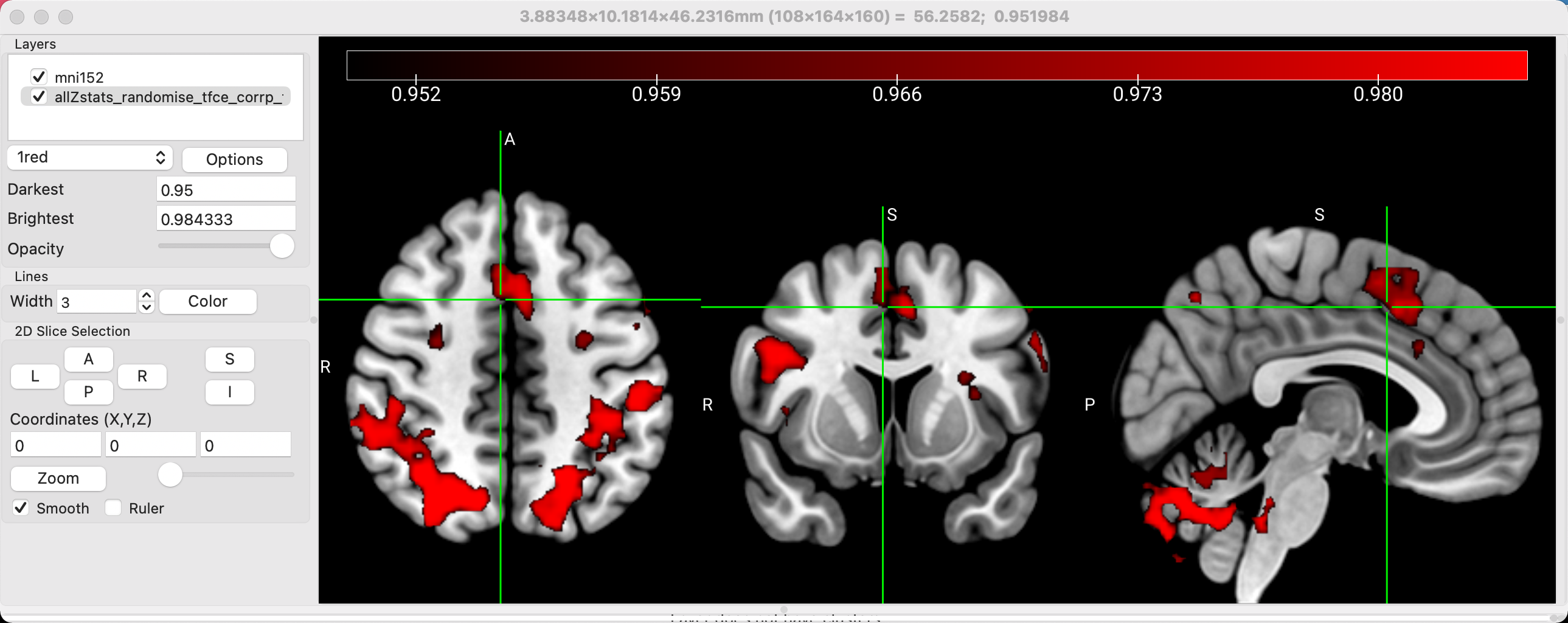
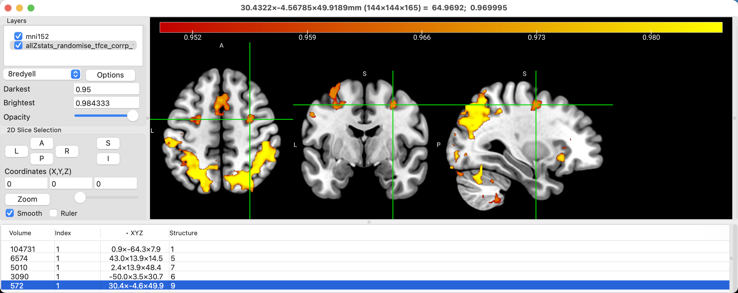
Staying with the results from our FSL analysis, we will first want to load a template as the underlay, or the image on which the results are overlaid. If you click on File and then hover your cursor over Open Standard, you will see a list of templates that come with MRIcroGL. Some of these are used for tutorials specific to MRIcroGL, such as the Iguana image, or any of the CT images. In this case, we will select mni152, a widely-used template in neuroimaging that is in standardized space.
Next, we will want to overlay a results image onto the template. You can load any results you want; in this tutorial, we will load the threshold-free cluster enhancement results from the contrast Incongruent-Congruent. Click on File -> Add Overlay, and select the file allZstats_randomise_tfce_corrp_tstat1.nii.gz. Remember that this particular file shows 1-p values; in other words, if we set the lower bound to 0.95, we will only see those voxels that have a p-value of 0.05 or less. Set the value in the field next to Darkest to 0.95, and you should see a thresholded image that looks like this:
Note
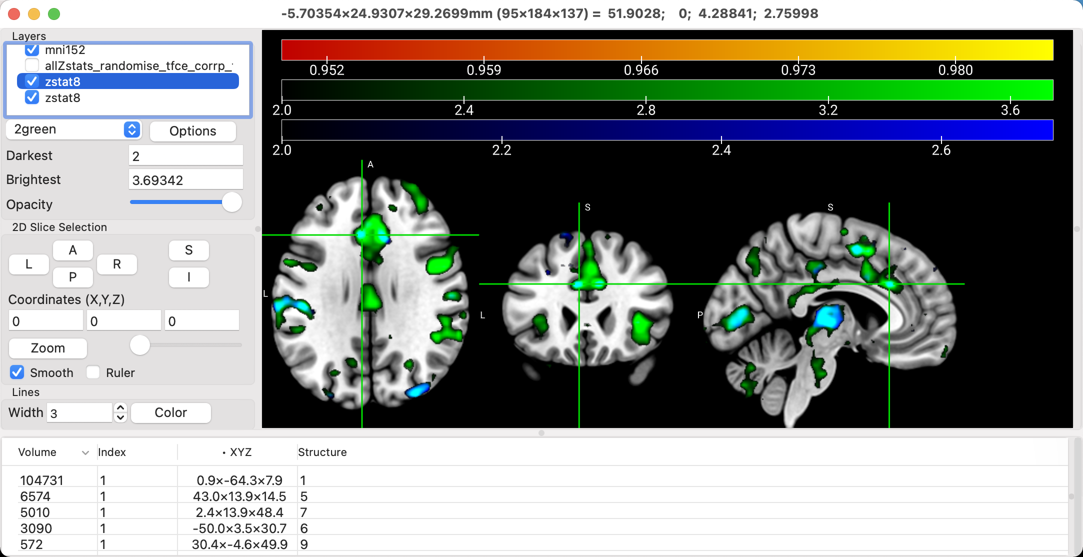
You can overlay multiple statistical maps on each other, with the color of the overlap representing a mixture of the colors of the individual overlays. For example, load the file zstat8.nii.gz for both the 2nd-level Incongruent and Congruent maps. They should default to colors of green and blue, although you can change this to whatever you want. To show the overlap of the two, click on Options -> Additive Overlay Blending. In this case, the overlap will be shown in Cyan.
Editing the Layout
If you had the crosshairs centered at the peak of the cluster that you wanted, and you removed the crosshairs, you could save this layout as a figure, minus the control bar and surrounding window frame, by selecting File -> Save Bitmap. However, let’s stay with this current setup, and see if we can modify the image to be more pleasing and informative to look at.
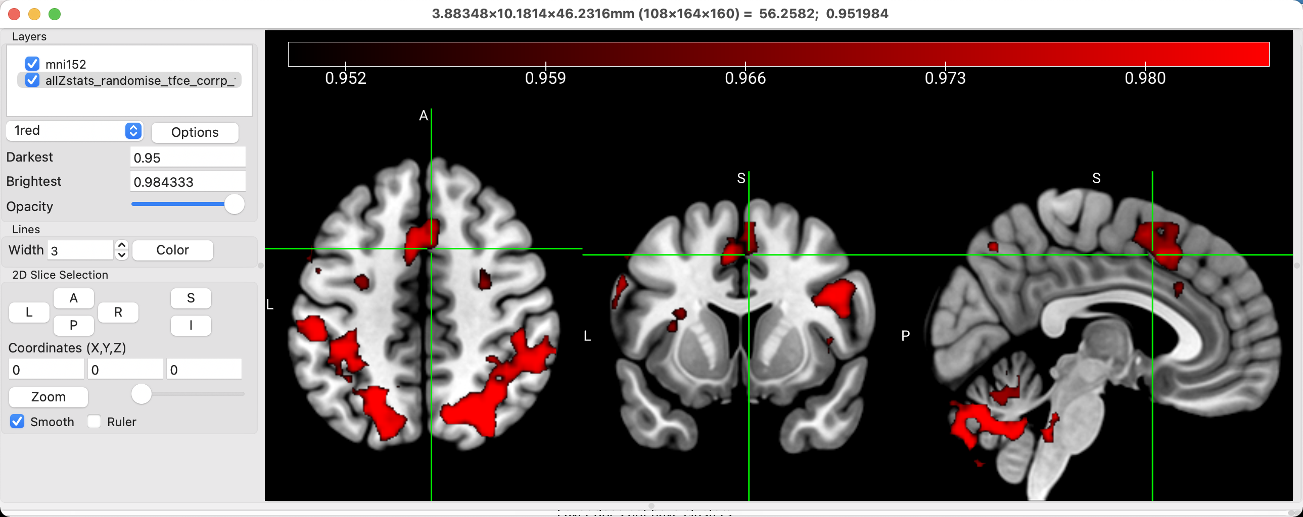
For example, the default in many viewing software packages is radiological convention, in which the right side of the brain is on the left side of the viewer, and vice versa for the left side of the brain. This viewing scheme makes sense if you are looking at the brain from the bottom, which is what many radiologists tend to do. For most people, on the other hand, it makes more intuitive sense to look at the brain in neurological convention, in which the left side of the brain is on the left side of the image, and the right side of the brain on the right side of the image. To change this, click on MRIcroGL -> Preferences, and uncheck the box next to Radiological convention. This will flip the brain image and swap the labels.
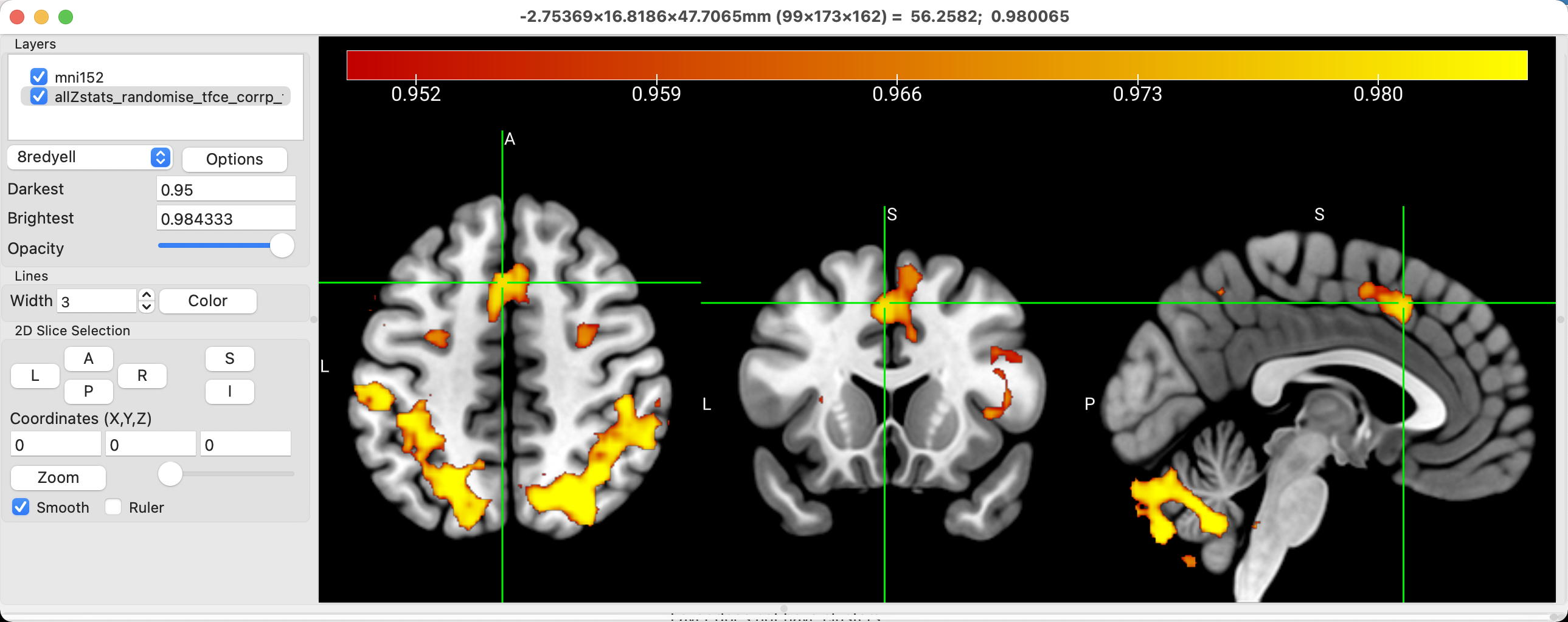
The current color palette might also be too saturated for your taste. You could either modify the intensity range to sharpen the distinction between voxels with different significance levels, or you could choose another color scheme. In the dropdown menu that says 1red, try changing it to 6warm. What do you think of this one? Change it again to 8redyell. Does this make the figure easier or more difficult to look at and interpret? Ultimately, these choices are up to you; there is no clear right or wrong answer. However, you should start to build up your own standards of taste, and think about why you make certain choices about your illustrations. How would this appear to somebody else who is not familiar with your data? What do you notice about figures you see in other papers that make them clear and easy to understand? These are the questions you can start asking yourself to build up your own aesthetic. Your primary consideration should always be the convenience of the reader; after that, you can make the stylistic choices that make your figures and your prose immediately recognizable, even when unsigned.
You may also choose to hide the crosshairs by setting the value in the Width box to 0, and to hide the color scale at the top by clicking on Color -> Colorbar and unchecking Visible. It’s up to you whether you think these overlays are necessary or unnecessary, and there are many more you can experiment with in the other menus of the software package.
Viewing Clusters
Similar to FSLeyes, you can view the clusters that survive correction, and display them in a table. Click on the Options button, and select Generate Cluster Table with Options. From here, you can select the voxel intensity and the cluster size as thresholds; in this case, setting the voxel intensity to 0.95 and the cluster size to 32 means to display only those clusters that are composed of 32 or more voxels, with each voxel in the cluster having an intensity value of 0.95 or greater. The dropdown menu with the Neighbor options allows you to specify how the contiguity of the voxels in the cluster is defined: Faces (6) means that the entire face of neighboring voxels need to touch in order to be contiguous; Faces, Edges (18) means that either the faces or the edges of the voxels can touch; and Faces, Edges, Corners (36) means that the faces, edges, or corners can touch in order for the voxels to be contiguous. In sum, the Faces (6) option sets a more demanding standard for what constitutes a cluster, while Faces, Edges, Corners (36) is more lenient.
In any case, this example uses the results of a TFCE analysis, in which all of the surviving voxels about the 0.95 threshold should be part of a statistically significant cluster. Click the OK button, and the clusters will be listed in a table at the bottom of the viewing window. Volume indicates the size of the cluster in cubic millimeters [or is it voxels? Need to double-check this], while the x-, y-, and z-coordinates are given in the XYZ column. Clicking on any of these clusters will make the crosshairs jump to the center of that cluster.
Overlaying Atlases
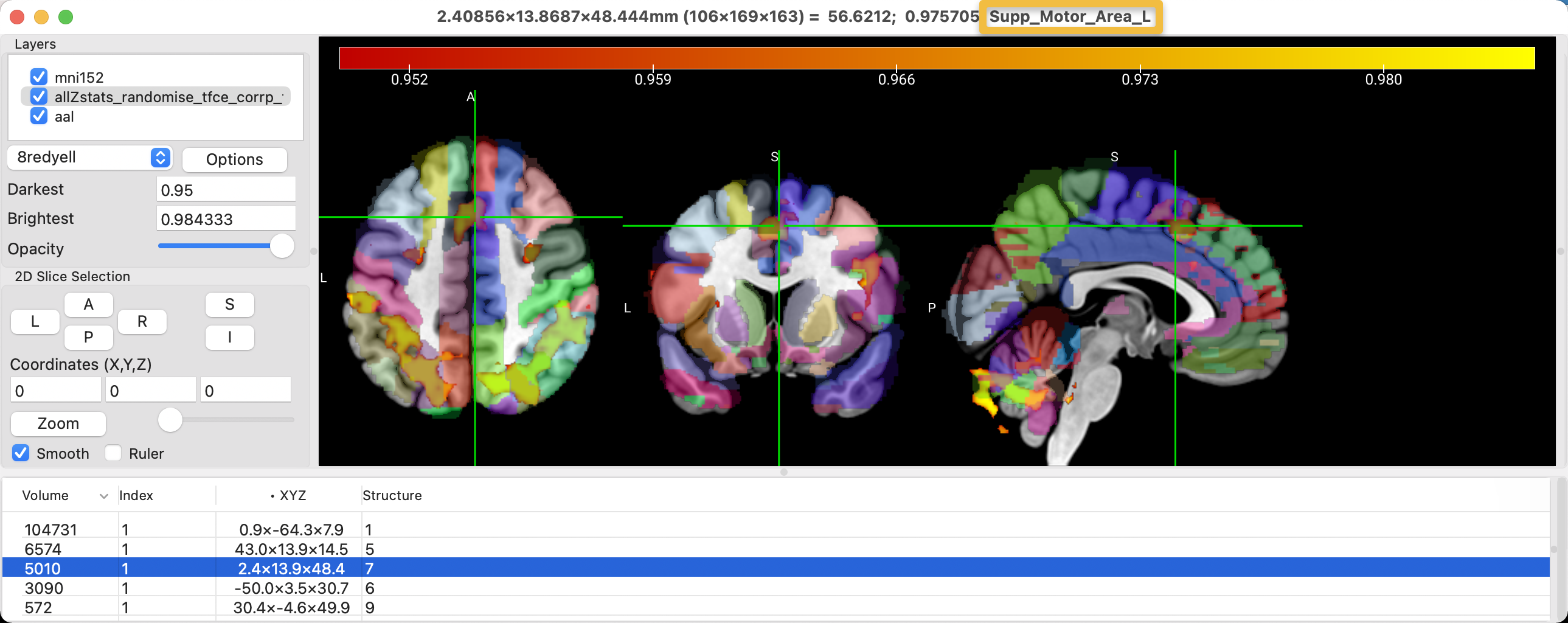
In addition to displaying the results, you may also want to know where the results are located, using an atlas as a guide. You probably won’t want to show the atlas as part of the figure that will be published, but a label for the location of the cluster, in addition to its coordinates, can be useful in a table of the results.
To see the atlases that are available with MRIcroGL, click on File -> Add Atlas. Add the aal atlas (Automated Anatomical Labeling), and note how you can see different structures color-coded on the template. The default opacity will allow you to see where the cluster is in relation to a particular structure, and the last string at the top of the MRIcroGL viewer tells you which structure the crosshairs are currently on. In this case, the cluster in the anterior middle part of the brain is located within the left supplementary motor area, according to the atlas.
Note
There are many other atlases that come with MRIcroGL; take a look at each of them and guess what they are atlases of. The natbrainlab atlas, for example, appears to be an atlas of the major white matter pathways, and it may be useful for looking at diffusion weighted imaging results obtained with FSL’s TBSS.
Rendering the Results
There are scenarios in which viewing the results on the surface of the brain can be more useful than viewing the results on three orthogonal slices. To get a more precise location of where the results are located along the gyri and sulci, it is necessary to do a surface-based analysis, using AFNI’s SUMA, for example. However, we can still get a rough idea of where the results are on the surface by rendering them; that is, interpolating volumetric data onto a surface.
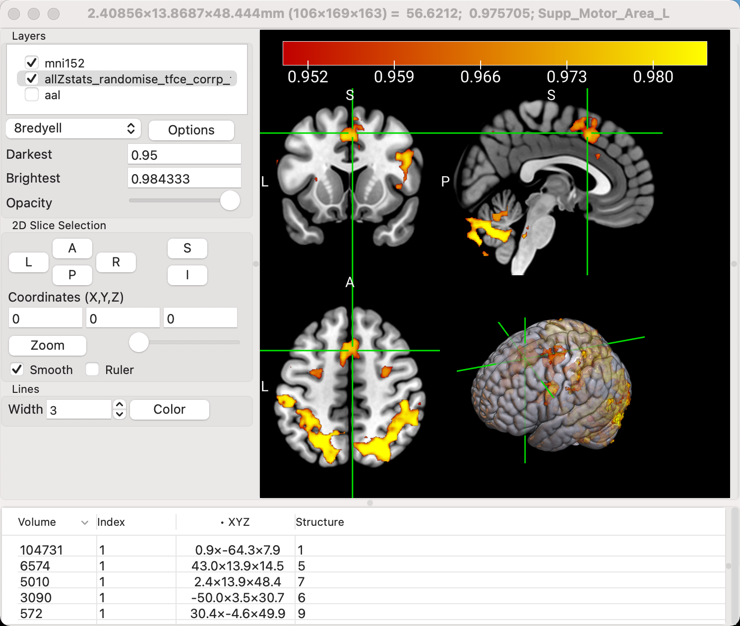
Uncheck the box next to the aal overlay to hide it (or right-click on it and select Close), and then go to Display -> Multi-Planar (A+C+S+R). This will add another view, a surface of the template brain with the results visible both on the surface and within the folds of the brain. This view is most useful when the activation is on the outer surface, such as the motor cortex or the dorsolateral prefrontal cortex.
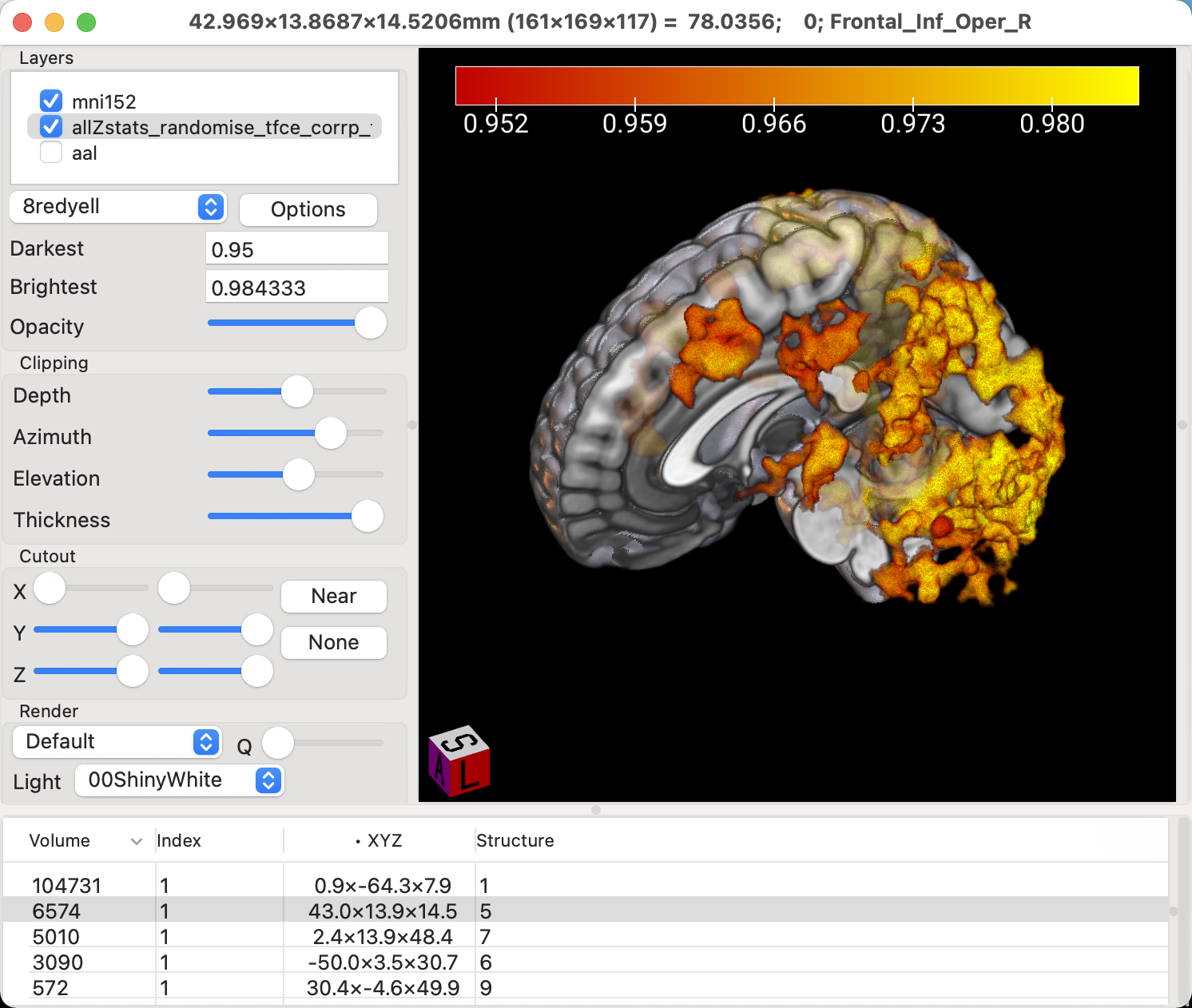
To see the activation more deeply within the brain, however, we will need to restrict our focus just to the rendered view of the brain. Click on Display -> Render, and the orthogonal volumetric views will be removed, leaving just the surface reconstruction of the image. You now have access to Clipping options, which can be used to remove parts of the surface of the brain. As you move the slider for Depth from left to right, the front of the brain is removed little by little. After you’ve moved the Depth slider about halfway down the scale, try moving the Azimuth slider; it will twist the clipped area around the z-axis. Lastly, the Elevation slider will move the clipped area around the y-axis. Experiment with all of them until you remove half of the brain, and can see part of the activation inside one of the hemispheres, and part of the activation extending outside of it.
Creating ROIs
MRIcroGL can be used to create regions of interest (ROIs; also called volumes of interest, or VOIs), similar to how we used tools in the other software packages to generate spheres for data extraction. For example, if we wanted to create a sphere with a radius of 5mm centered at the coordinates 0, 20, 44, we would first enter those coordinates into the fields below Coordinates (X,Y,Z). Then, click on Draw -> Advanced -> Automatic Drawing. The two fields, Difference from origin and Radius (mm), specify how different a voxel’s intensity is allowed to be from the crosshairs and the radius of the sphere, respectively. If you set the Difference from origin to 100, for example, then any neighboring voxels that are within an intensity value of 100 will be added to the ROI. This can be useful if you want to restrict the ROI to a certain tissue type, such as neighboring grey matter. For now, set the Difference value to 500, which should create a perfectly round sphere, regardless of which tissue types it covers. Set the dropdown menu selection to Append to current VOI, and you should see something like this:
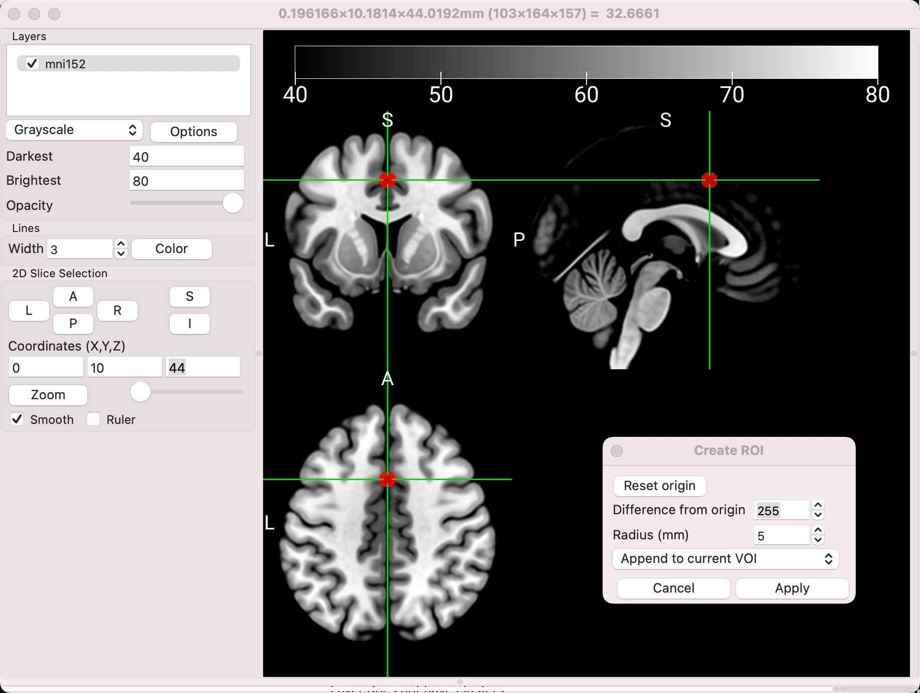
You can then save the ROI by clicking Draw -> Save VOI, and saving it wherever you want. Remember that the ROI will need to be resampled to the data you are extracting from; more details about those steps can be found here. Many other ROI transformations, such as dilating or eroding the region, can also be found under the Draw -> Advanced menu.
Video
For a video walkthrough of how to visualize results with MRIcroGL, click here.
Summary
Having learned some of the features of MRIcroGL, you now have more choices in how you want to perform different tasks - converting DICOM images, visualizing results, and creating ROIs, to name a few. The software package also has other options for reorienting and resizing images, converting TIFFs to NIFTI, and many different display tools. I encourage you to explore them on your own, and see which ones suit you best.