Chapter #6: Quality Assurance Checks
Overview
When preprocessing the data, a good habit is to examine the images before and after each step to determine whether everything ran without error, or if instead there is something you need to double-check or redo. We will first use the buttons on the left side of the CONN GUI to examine the output of some preprocessing steps, and then use the QA Plots button in the bottom left of the CONN GUI to create a comprehensive QA report.
Revisiting the Structural and Functional Tabs
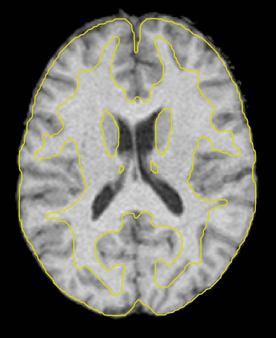
Once the preprocessing has finished, click on the Structural tab again. You will notice that the anatomical image looks different; in fact it has been skull-stripped, resampled to 1mm^3 resolution, and normalized to match the MNI template. Scroll through the different views to make sure that the brain looks as though it has been normalized properly. It may take some time to develop a feeling for what a properly normalized brain looks like, but in general the brain should now look like it has a normal size and shape; any irregularities, such as an abnormally long or small brain, for example, should be smoothed out.
We can examine the image more in-depth by using some of the viewer options. If you click on the -structural tools: menu and select Slice viewer with MNI boundaries (QA_NORM), you will see the outlines of the MNI template traced in yellow on top of the anatomical image. Observe how the yellow lines roughly outline the boundary between the white matter and the grey matter of the anatomical image. The normalization won’t be perfect, but the general outlines should match up.
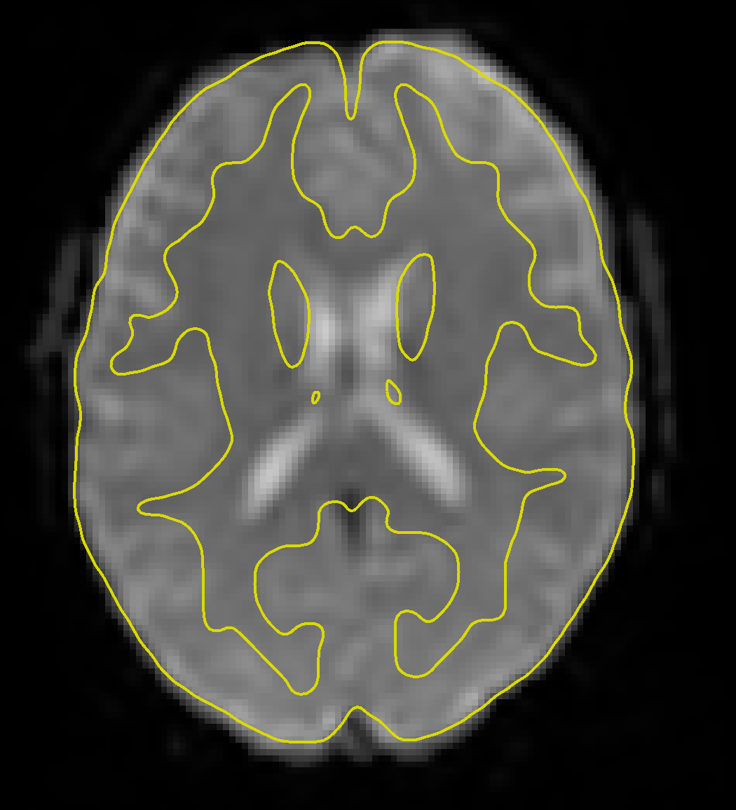
Clicking on the Functional tab reveals a similar change - the functional data have now been fully preprocessed, which has included normalization and smoothing. Clicking on the -functional tools: menu and selecting the Slice viewer with MNI boundaries (QA_NORM), as with the anatomical image, will show a yellow line dividing the white and grey matter. The general outline of the MNI template should also encompass the functional image. If both the anatomical and functional data are aligned with the MNI template, this indicates that the preprocessing was successful.
The ROIs Tab
We now come to the Regions of Interest (ROIs) tab, which lists the different regions that will be used in the connectivity analysis. Since we are primarily interested in the resting-state signal from the grey matter, we will parcellate the cortex into different regions, also called nodes or regions of interest, and extract the average time-series from each of them. Groups of nodes can be combined into networks that show consistent correlation in their resting-state signal. We will learn how to examine each of these in more detail.
Grey Matter, White Matter, and CSF
Clicking on the ROIs tab reveals that five sets of ROIs have already been generated for you: Grey Matter, White Matter, CSF, atlas, and networks. Let’s begin with the first three, which correspond to the tissue types that make up the brain. One of the preprocessing steps, Segmentation, classified each voxel in the anatomical image as belonging to one of these three tissue types (for more details on how this is done, see the SPM tutorial on Segmentation). The anatomical image was used for segmentation because it has higher spatial resolution than the functional image; but since we are ultimately interested in data from the functional image, we then have to resample these tissue maps onto the functional data.
The two side-by-side axial slices illustrate how the grey matter mask looks both before and after it has been binarized (i.e., set to 1’s where the mask is grey matter, and 0’s everywhere else), and then slightly eroded. This erosion makes the mask slightly more conservative in what it determines to be grey matter, since voxels near the boundary of the grey and white matter will be excluded. Clicking on either slice will open up a montage window that you can use to more closely examine the overlap between the grey matter mask and the grey matter of the functional image.
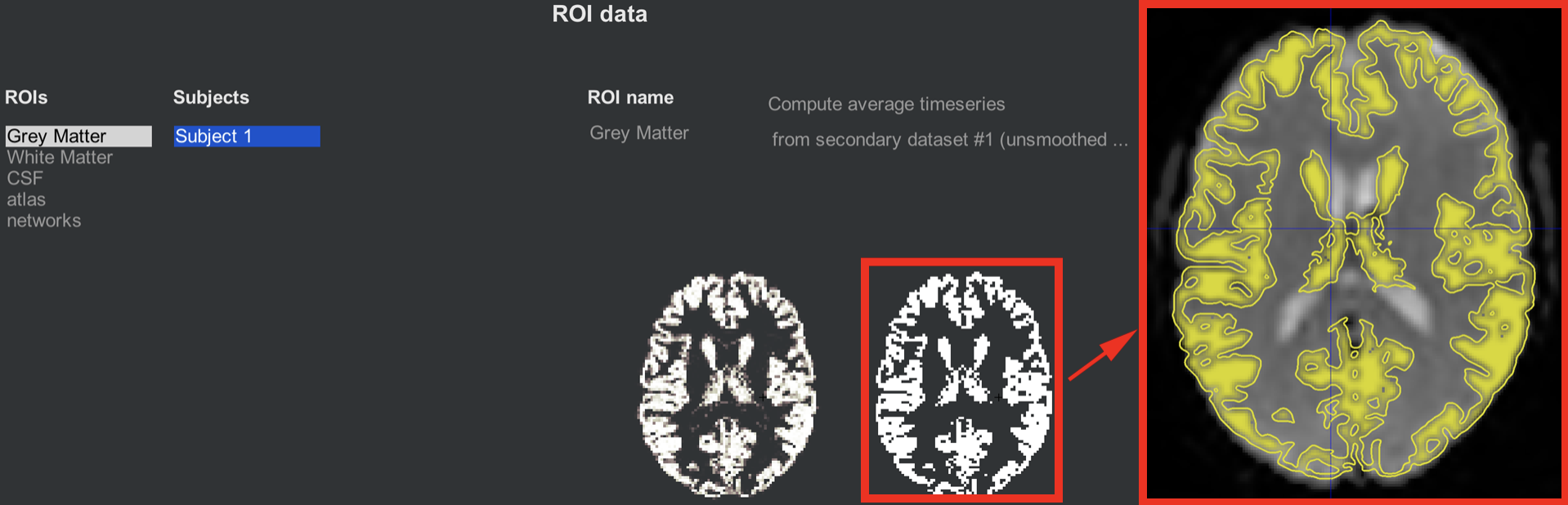
Illustration of the grey matter ROI mask before (left) and after (right) thresholding. The inset shows the grey matter mask overlaid on the functional data, which you can open by clicking on either of the axial slices. Similar images are displayed for the White Matter and CSF tabs.
Note
Next to the ROI name field, you will see a couple of options: The first one, “Compute average timeseries,” indicates that the time-series will be averaged across the voxels within that mask, which is typically done within the Grey Matter mask. For the other tissue maps, White Matter and CSF, the option changes to Compute PCA Decomposition, which performs a PCA to generate a number of time-series that are representative that tissue type. Since we assume that the resting-state signal should be fundamentally different depending on which tissue type we are extracting data from, we will enter this PCA as a nuisance regressor when Denoising the data - our next step after this chapter.
For both computing the average time-series and doing PCA, you can choose to do a weighted version of either one. In this case, more weight will be given to voxels determined by the Segmentation step to more likely belong to one tissue type than the others.
Also note that there is another indicator, labeled from secondary dataset #1 (unsmoothed), which will extract the time-series from the unsmoothed data. In other words, the smoothing step is performed in case you want those images, but by default the extracted data is unsmoothed - the idea being that there is less mixing of signal between different tissue types in the unsmoothed data.
Atlases and Networks
The CONN toolbox comes with atlases, or ways to parcellate the grey matter into different nodes. By default, the grey matter is partitioned according to the Harvard-Oxford Cortical Atlas, and the cerebellum is partitioned according to the AAL atlas. In order to see these atlases in more detail, clicking on the parcellated 3D brain will open a viewing window illustrating how the atlas has been resampled to the functional data. For example, the parcellation colored in orange indicates the anterior cingulate. Hovering your mouse around the different colors will return a string showing which ROI you are pointing to. Later on, we will use these ROIs in our 1st-level analysis to generate connectivity maps between those ROIs and all of the other voxels in the brain.
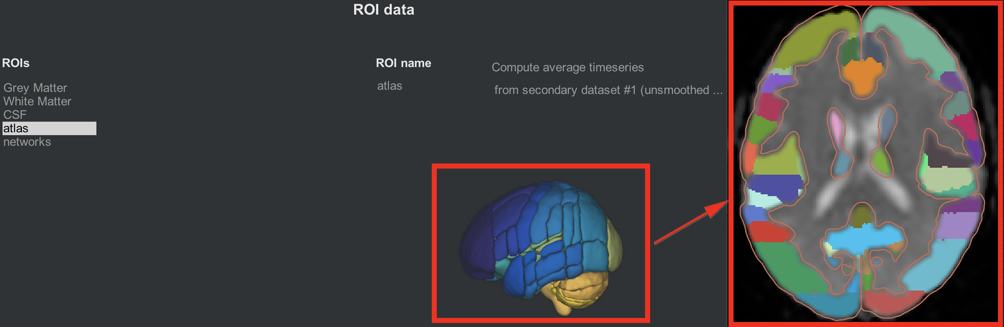
The same idea is illustrated in the networks tab, which assigns groups of nodes to a single network. The Default-Mode Network, for example, is a combination of a node in the posterior cingulate cortex and a node in the ventromedial prefrontal cortex. As with the cortical ROIs, you can open a slice-viewing window by clicking on the 3D network parcellation.
Covariates (1st-level)
Another output from preprocessing is the creation of nuisance regressors, or covariates that represent signal that we are either uninterested in or are trying to disentangle from the signal that we are interested in. Motion is a classic example of a nuisance regressor: We are typically not interested in signal generated by the subject moving around, and we want to remove any confounding effects of movement on the signal that we are interested in, such as resting-state signal.
Clicking on the Covariates (1st-level) tab reveals three covariates that have been generated by default: Realignment, QC_timeseries, and scrubbing. The realignment covariate is a set of six movement parameters representing movement in the three translational and rotational directions. (For more details about how motion correction works, see this chapter.) Hovering the mouse around the movement parameters will display a vector of six numbers representing the average motion in all six directions at that timepoint.
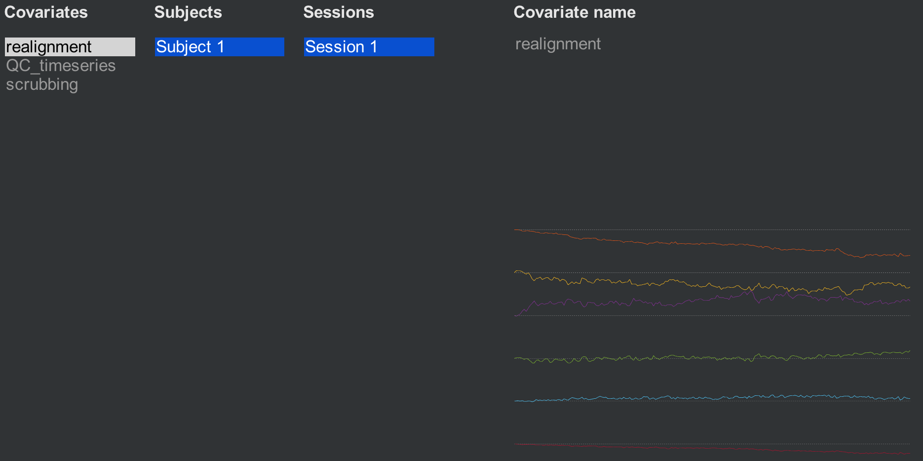
The second covariate, QC_timeseries, computes an additional measure of motion called Framewise Displacement (FD). This is a type of composite measure of all of the movement parameters, and the formula varies slightly between different research groups. The default in CONN is the FD computed by the ART toolbox; if you want to use another FD formula, click on the -covariate tools: menu and select compute new/derived first-level covariates. This will open up another window with other options to choose from.
The last covariate, scrubbing, will display any volumes that have been modeled out of the data, or scrubbed. This subject was very still during the scanning, so no volumes have been removed.
Generating QA Plots
You can summarize all of the QA checks we did above by clicking the QA plots button in the bottom-left corner of the CONN GUI. In the window that opens up, click Create new report, and label it whatever you want. Then click Create new plot, and select any of the QA checks that you are interested in. The default ones that are highlighted will display checks such as the functional and structural data on the MNI template and the motion parameters. When you have chosen the QA plots that you want, click Start.
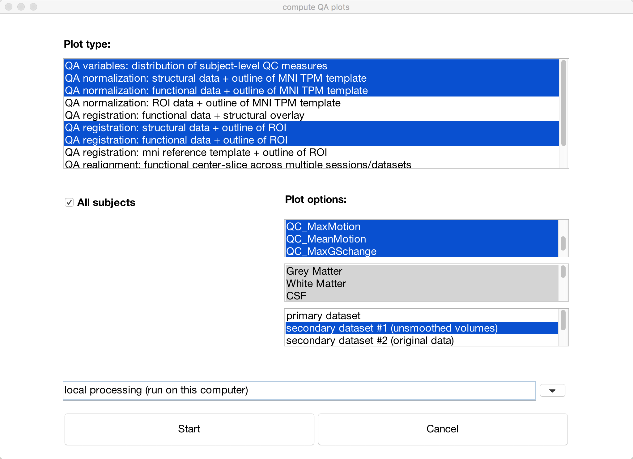
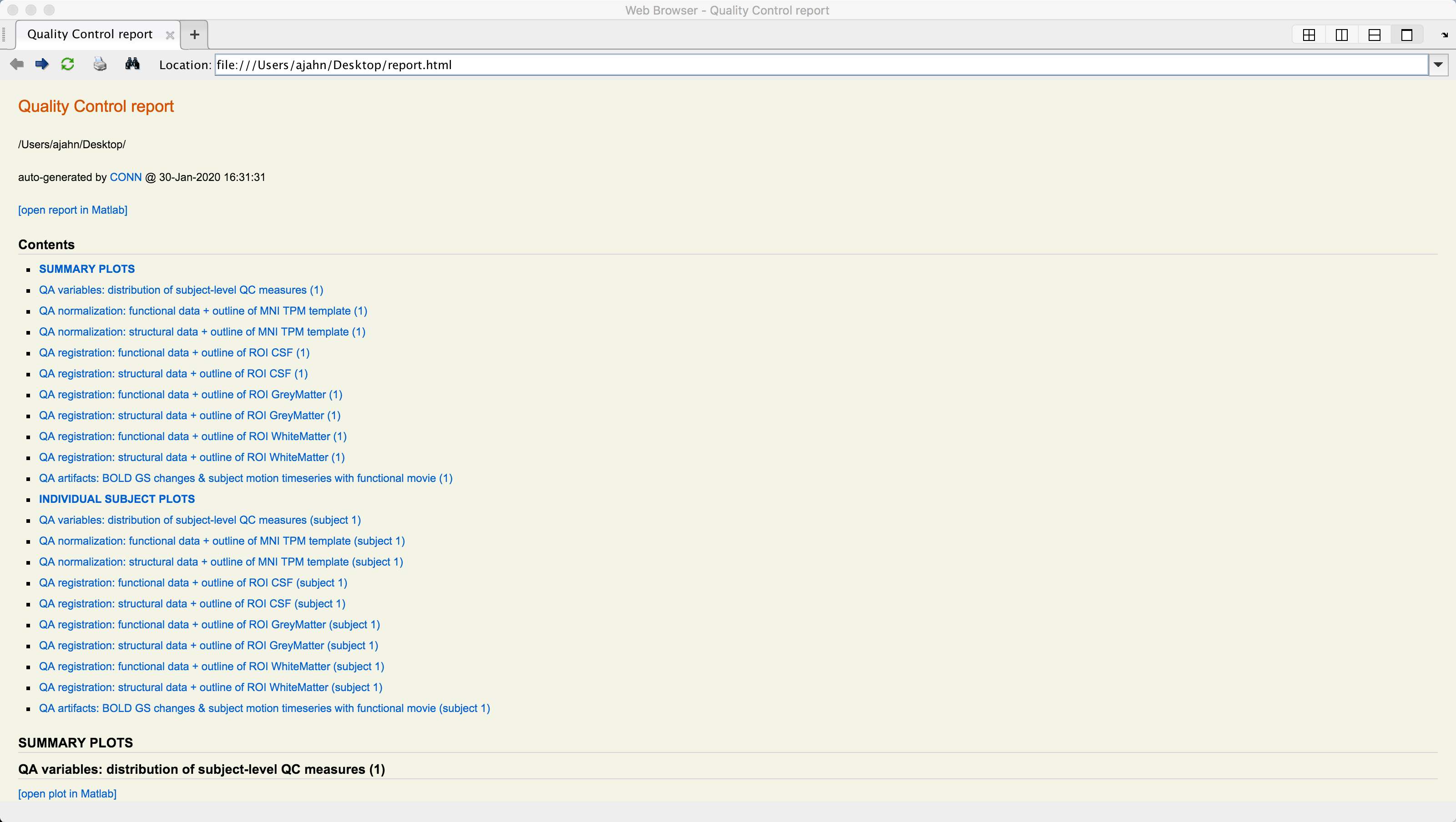
A series of figures will be generated, one for each QA check that you selected. You can then click on the Export button to generate an HTML file containing all of the QA checks.
Exercises
One helpful QA check is to view a movie of the functional volumes juxtaposed with movement covariates; that way, you can see how the volume changes as a result of motion. Click on
Covariates (1st-level), make sure thatrealignmentis selected, and then clickcovariate tools -> display covariate & single slice functional (movie). Selectprimary datasetfor viewing. This will open a new window that displays a single axial slice of the functional data, and displays each of the movement parameters underneath it. If there are any large motions, it should be reflected in the functional volume as well. Now, try the same approach, this time highlighting thescrubbingcovariate for a subject that has at least one volume that was scrubbed. Does the movie suggest that this volume ought to have been removed? Why or why not?Within the
Covariates (1st-level)section, you are able to generate many other new covariates as well. For example, you may want to use a different method to calculate thresholds that should be used to remove certain volumes. Click oncovariate tools -> Compute new/derived first-level covariates. Imagine that you’ve read the Power et al. 2012 paper, and you want to use that to calculate Framewise Displacement (FD), a kind of composite measure of motion for each volume. Select that option, and keep the defaults. (If you want to make a more informed decision about how to change these parameters, refer to the original Power et al. 2012 article.) ClickOK. Now, do the same for creating a new covariate forFD_conn. Note any differences between the two, and think about which one you would prefer to use, and why.Multiple-dimension covariates, such as the realignment parameters, can be split into its individual components. Let’s say that you wanted to just include the translation parameters, for example. First, highlight the
realignmentcovariate, and then click again oncovariate tools, this time selectingSplit multiple-dimension covariate into multiple individual-dimension covariates. (Note: You may have to click another Setup button, and then re-selectCovariates (1st-level), to see the changes take effect.)Create a new QA report with the following plots: 1) QA normalization: structural data + outline of MNI TPM template; 2) QA normalization: functional data + outline of MNI TPM template; and 3) QA artifacts: BOLD GS changes & subject motion timeseries with functional movie. Take screenshots of the QA normalization plots that you generated. (Hint: After you’ve created the report, these can be found by clicking on the
Plotsdropdown menu.)Create your own QA report, including one plot each for the results of normalization, registration, artifacts, and denoising. Show screenshots of each one that you generated. Why did you select these ones in particular? Which ones do you think would be the most helpful for QA reports of your own experiment, and why?
Video
For a video demonstration of how to do QA checks in the CONN toolbox, click here.
Next Steps
If you are satisfied with your QA checks, you are now ready to begin Denoising the data. This will further clean up the data using processing specific to resting-state data, and prepare it for statistical analysis.